I believe that a good customer experience map should never be the end goal - it should be created with a purpose beyond the map itself and filled with the most appropriate information to serve an outcome for your business or organisation. You want insight you can act on. You want a visualisation that is referenced often because it’s useful and succinct. You want people in the team to feel empowered to make informed decisions and work towards a shared vision.
So how can you determine whether or not an experience map is right for you and what you should be measuring? And how do you go about acting on what you find? Read on my friend.
Business outcomes? There’s a map for that
In order to know what to measurement will serve you best, it’s important to start with what you want to achieve. Below are three outcomes I’ve come across that mapping your customer journey and experience can help to achieve (although often it’s a combination):
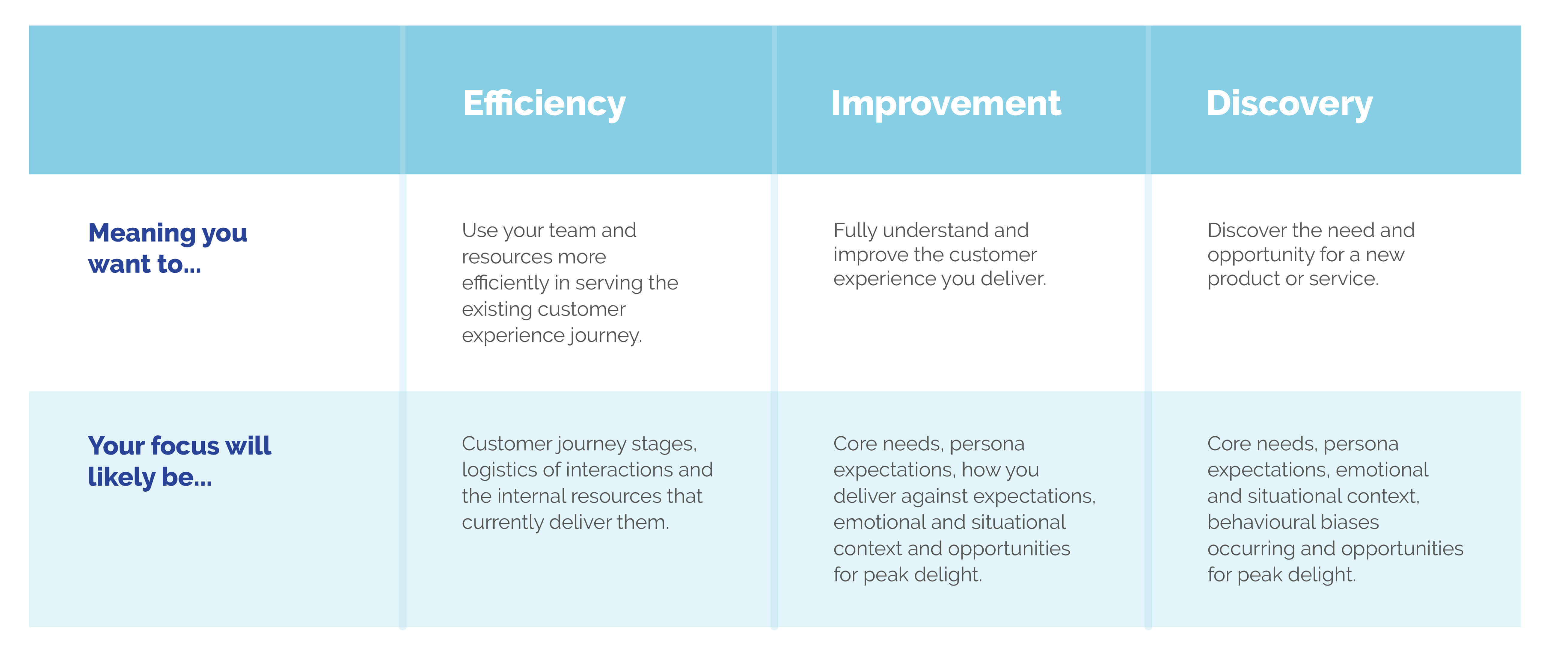
- Efficiency - You want to make efficiencies in your internal team and resource whilst continuing to serve the existing customer journey.
- Improvement - You want to understand how you can improve the experience you provide.
- Discovery - You want to discover the opportunity for a new product or service in a particular scenario.
It’s worth remembering that whichever your desired outcome is, you should always approach this from the customers’ perspective. And that means input from your customers. Don’t assume you know it all, even if you have collected data and feedback previously. I’ve yet to be involved in a customer experience mapping project in which we haven’t uncovered something important that wasn’t previously known to the client. So whether it’s interviews, surveys or focus groups, be sure to capture your data from those who know the experience best - the customers.
A solid understanding of why you want to look into your customer experience will lead you to what format and measurement is going to be most useful. Next we’ll look at what should, could and shouldn’t be included in your experience map.
But first, an interlude.
I interrupt this flow for a quick terminology calibration…
Talk the talk: a short CX glossary
In an industry that doesn’t always agree on terms, I want to share my definitions so we can understand each other clearly. It doesn’t matter if you use these words to mean different things in your organisation. What matters is that we understand each other. So here’s how I use the following terms.
User journey: A description of how the customer gets from point a to point b via interactions with the product or service you provide. This is descriptive of the stages and logistics between the customer and the product or service. It may not be the whole journey from start to end, you could just cover a section, for example, onboarding. It also doesn’t need to span all customers, it may be persona specific.
User journey stages: Stages that the customer journey is split up into, with a unique customer objective or need defining each stage.
Experience map: A visualisation of the journey and how the customer experiences it, featuring emotional and situational context at each stage. This includes but isn’t limited to:
- Customers’ emotional needs and pain points
- Expectation of the experience
- Customers’ situation, influences and context outside of the direct interaction with your product or service
Persona: A categorisation for a group of customers who share a need and experience from your product or service. Different personas should only exist when a different experience is required from your product or service. Oh and resist the urge to unleash your creative flair when naming personas. I’m not a ‘digitally literate self-striving snowflake’. I’m a digital professional. Keep it Ronseal.
And now to resume what you should be measuring in your customer experience map…
What to include in your CX map
As you know, experience maps should serve the outcome and showcase your research in the most accessible and helpful way. Don’t be tempted to try to squeeze in as much information as possible. It’s a data visualisation and reference point, not an extensive report. You want to communicate the information to inform decisions. Here’s my two cents on what that information is, although these aren’t exhaustive lists:
Always include
- Descriptive and logistical information of customer interactions
- Emotional needs and pain points
- Situational context outside of direct interactions with the product or service
- Customer expectation
Sometimes include
- All stages in the customers’ experience, even if this is before their first interaction, or after their last interaction, with your product or service
- Quotes from customers to bring key insights to life in their words
- Key statistics to add high-level context
- Internal resource that delivers the customer journey (eg. operations, tech stack, customer service process)
Don’t include
- Assumptions - all content should be from customers and/or research
- Paragraphs of copy about the interaction or situation - remember it’s a visualisation, not a report
- Method of gathering research and data - save this for the supporting materials
Just because you can include all of these details, doesn’t mean you should. It’s easy to veer towards information overload and in my experience culling, unnecessary information from the customer experience map is something many people are uncomfortable with. But it will only serve to distract from the true value of this work. Whilst the research itself will, and should, cover far more detail than you’ll ever fit on an experience map, the map itself should only include the most distilled, clear and valuable insight.
So let’s revisit our mapping outcomes and see what the likely focuses for each of these might be.
How to prioritise your CX initiatives
You’ve done your research. You’ve spoken to customers. You’ve visualised the findings. What next? It’s not always obvious which area of the journey, or potential solution, to prioritise. Again I take you back to the intended outcome.
If you’re looking to make efficiencies in your internal resources, you may have many possibilities and be unsure which to pursue first. There might also be a differing opinion about which potential solution is the best to go within a group of stakeholders. In this scenario, the first way to narrow down your options is a simple impact vs resource chart, as shown here.
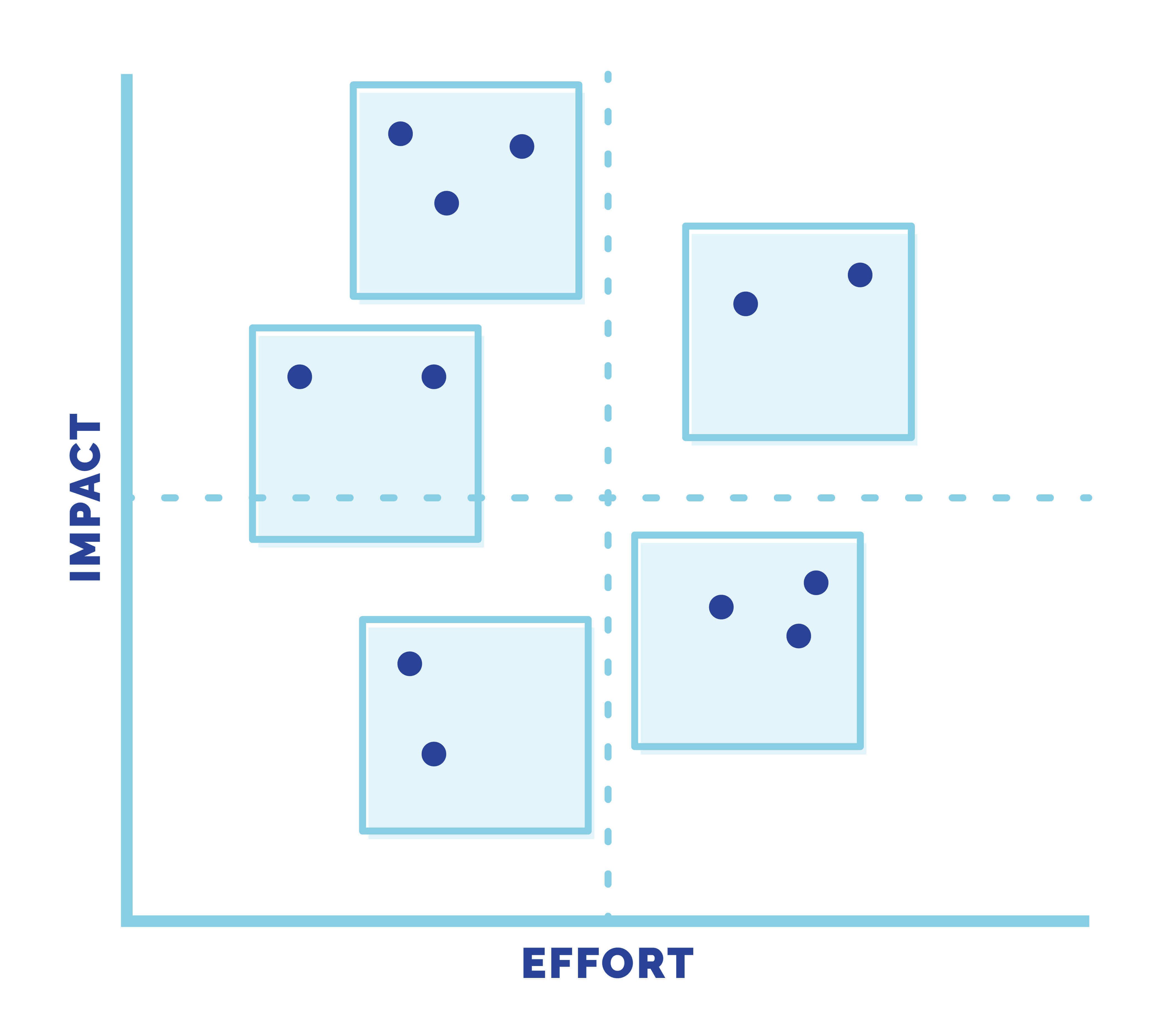
The exercise isn’t an exact science, but rather a collective process to give you an indication of which options are worth prioritising. The holy grail here is something with a high positive business impact once in place and a low volume of resource needed to implement. Here’s a general rule you can follow once adding all potential solutions to the chart.
Top left = Do it now
Bottom left = Make it a task
Top right = Make it a project
Bottom right = Park it for now
If you’re looking to improve the customer experience, you will likely be faced with multiple opportunities in your map. It may have highlighted stages in the journey where there are pain points, stages where the customers expect better and stages where you could elevate the experience from good to great. So where do you start?
The key here is to understand how people recall experiences. Your customers won’t remember the emotional sum of all stages of their journey with you. Instead, they’ll remember how they felt at the most intense point, or peak, and how they felt at the end. This is referred to as peak-end theory. It’s important to remember that the peak isn’t necessarily going to be positive if something intensely negative is outweighing it. As humans, we are preconditioned to place more weighting on negatives over positives, and our experiences with brands are no exception.
Peak-end theory and impactful customer experiences
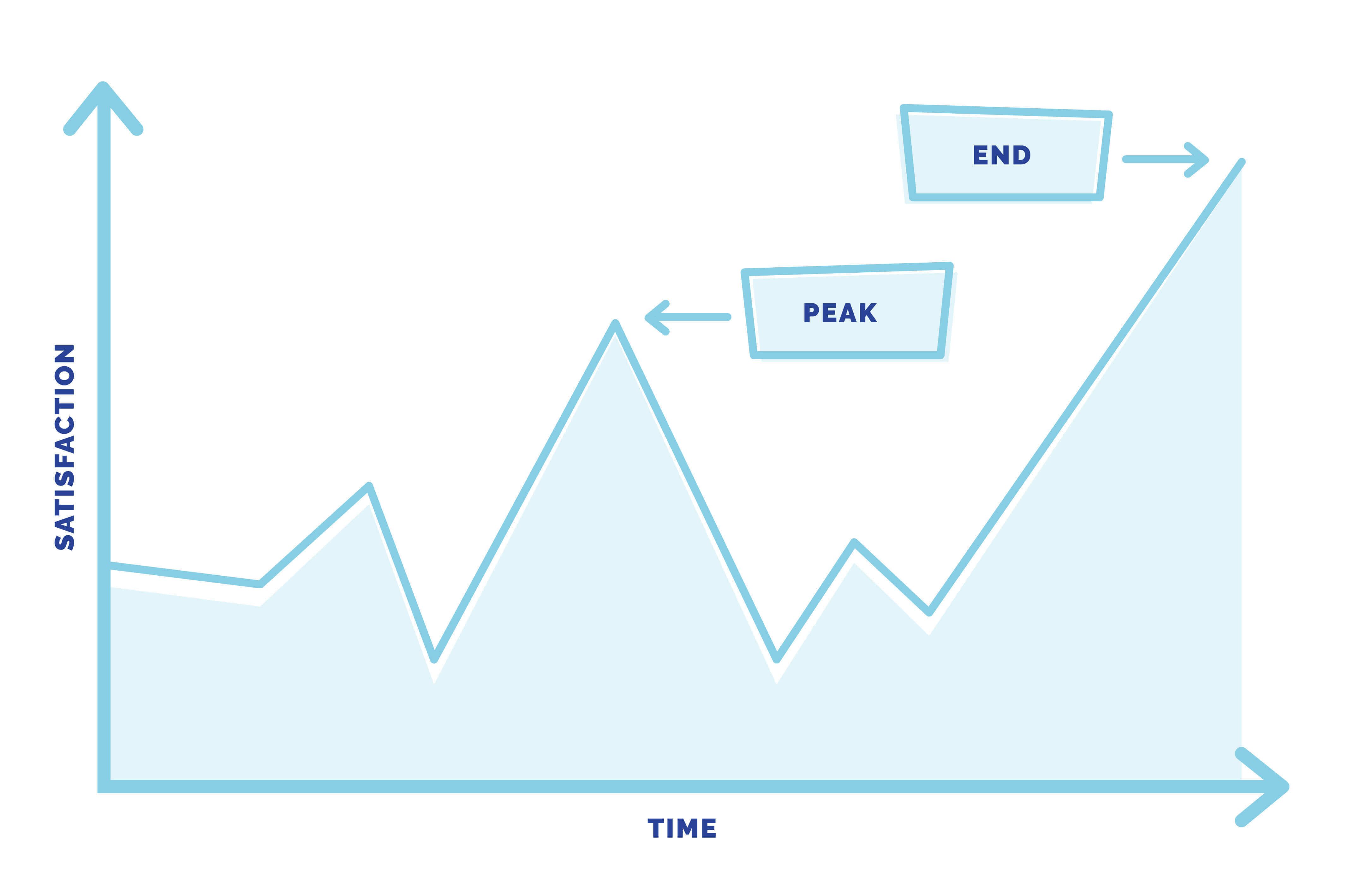
Peak-end theory makes two significant points that you should apply to your customer experience. Firstly, if there’s no intense emotional peak (positive or negative), then the experience will be less memorable. Or in other words, if an experience delivers efficiently and exactly as expected, it won’t be recalled or retold by your customers. People need to be delighted by something they don’t expect to form strong memories and loyalties to brands. Secondly, if you overdeliver in your experience in a moment of delight, but then underdeliver with something that falls below expectation, this won’t be remembered as a neutral experience, but a poor one.
And so, here lies the direction on how to prioritise improvements; bring your customer experience up to expectation across the whole journey, then once you meet expectation, introduce moments of peak delight for a positively memorable experience.
The same rules apply when using experience mapping for discovery of how to identify the opportunity for a new product or service. By understanding the current stages people go through, their expectations and their context, you can deliver to expectation and highlight opportunities to add peak moments of delight for a positive and memorable experience.
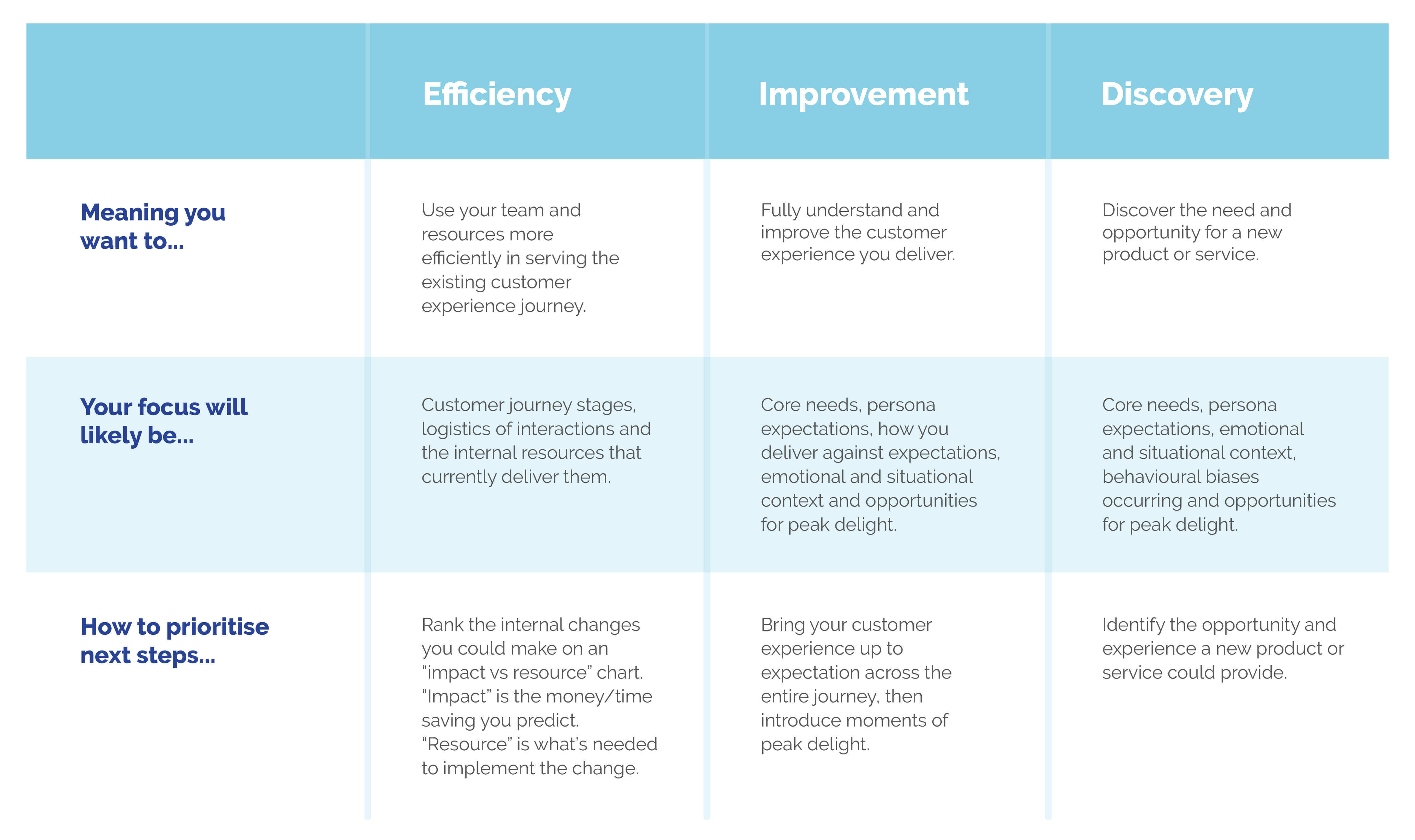
In summary, here’s how you can use experience maps to reach a better outcome for your business or organisation.
Did you spot anything I’ve missed in customer experience map considerations? All thoughts, comments and heckles will be happily received.


